Ever wondered why certain brands instantly catch your eye or evoke specific emotions? The answer lies in the fascinating realm of brand colors.

Brand colors go beyond aesthetics; they play a crucial role in shaping consumer perception. The selection isn’t arbitrary – it’s a strategic decision that can influence how your audience perceives your brand. In this exploration of the psychology behind brand colors, we unravel the impact these hues have on consumer behavior, delving into the significance of choosing the right palette for your brand identity.
Importance of Brand Colors
Brand colors play a vital role in how consumers perceive and interact with your brand. Take Starbucks, for example – the color green immediately comes to mind. McDonald’s is all about those yellow arches, and Facebook is synonymous with blue. These colors are consistent across their entire brand.
Emotions are a powerful force in decision-making, and as a brand, you want to create a strong emotional connection with your customers. The challenge is that you can’t tell your whole company story in a logo or storefront. That’s where brand colors come in – they act as a shortcut straight to your customers’ hearts.
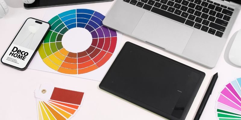
What is Color Psychology?
Color psychology means exploring how different colors impact our feelings and decision-making. Each color, whether it’s a bold hue or a subtle shade, comes with its own set of associations that can affect our mood and choices. It’s worth noting that these effects can vary based on personal preferences and cultural influences.
In the world of marketing, the colors you pick can have a significant impact on how customers see your brand and products. Choosing the right tones is crucial to aligning with your business goals and connecting effectively with your target audience. So, when you’re thinking about the colors for your brand, consider the emotions and impressions you want to stir up in your customers.
How Brands Use Color Psychology?
The colors you choose can shape the very first impression people have of a brand or product. When consumers see specific colors, they attach certain feelings to the product. These color-related feelings then play a big role in how consumers view your brand.

Understanding color psychology is crucial because it significantly influences how people make decisions and judge brands.
- Around 90% of what someone notices first comes from the color they see.
- Colors can boost brand recognition by a whopping 80%.
- An impressive 93% of consumers decide to buy something based on what they see visually.
The impact of color in brand marketing is evident in the thoughtful choices made by various successful companies. Coca-Cola, with its vibrant red, taps into the energy and passion associated with the color, creating an enthusiastic brand image. Tech giants like IBM and Facebook opt for blue, conveying trust and professionalism crucial in the technology industry. Cadbury’s regal purple exudes luxury and sophistication, elevating the perception of their chocolates. McDonald’s cleverly combines yellow and red to create a welcoming and appetizing atmosphere. These examples underscore how strategic color selection is a potent tool for influencing consumer emotions and shaping brand identity.
Colors and the Emotions they Evoke
1. Blue:
Blue emerges as the world’s top favorite color, winning over 57% of men and 35% of women. This serene hue isn’t just popular among individuals but also dominates the branding world, being the preferred choice for logos for 33% of leading brands. The color blue is a master of emotions, stirring up feelings of security, strength, wisdom, and trust.

Let’s take a closer look at some of the brands that embrace the calming charm of blue in their logos:
- Meta, formerly known as Facebook, utilizes shades of blue to maintain a trustworthy image.
- LinkedIn, the professional networking platform, embraces blue to signify reliability and competence.
- Skype, a pioneer in communication technology, also incorporates blue, emphasizing its commitment to secure and dependable services.
These examples showcase how the color blue is not just a crowd-pleaser but also a strategic choice for brands aiming to evoke positive emotions and establish trust.
However, it’s worth noting that, like any color, blue navigates a nuanced spectrum of emotions and perceptions, with some potentially negative associations such as suppressing appetites and conveying coldness.
2. Purple:
The color purple is steeped in history, symbolizing royalty and superiority. Back in the Roman Empire, high-ranking officials proudly adorned themselves in Tyrian purple, a hue more precious than gold at the time. Queen Elizabeth I even went as far as banning non-royals from wearing purple, solidifying its regal status. This rich historical connection gives purple an aura of wisdom, wealth, and sophistication.

For brands, incorporating this color becomes a potent signal for superior services, products, or experiences. However, it’s essential to tread carefully, as purple also carries associations of decadence, moodiness, and excess. Striking the right balance is key when weaving this majestic color into your brand, ensuring a positive and harmonious association.
Let’s explore some brands that have successfully embraced the royal charm of purple in their logos:
- Cadbury, the renowned chocolatier, uses purple to convey indulgence and high quality.
- Yahoo, a pioneer in the digital era, incorporates purple to project innovation and creativity.
- Twitch, the popular streaming platform, utilizes shades of purple to create a sense of community and entertainment.
These examples highlight how purple, with its historical grandeur, can be a compelling choice for brands seeking to communicate sophistication and excellence.
3. Orange:
Orange is the perfect choice for brands looking to break free from the corporate norm. This warm and sunny hue brings feelings of positivity, often linked with the cheerful rays of the sun.

However, it’s not all sunshine and rainbows with orange. There’s a flip side, it can occasionally evoke feelings of frustration, sadness, or sluggishness. Some may even perceive it as a tad immature or clueless. Surprisingly, 29% of people rank orange as their least favorite color. So, while orange is an excellent pick for injecting energy and fun into your brand, it’s wise to be mindful of its dual nature and consider how it aligns with your overall message and vibe.
Now, let’s peek at some brands that have embraced the lively spirit of orange in their logos:
- Home Depot, the home improvement giant, uses orange to signify energy and excitement.
- Nickelodeon, the beloved kids’ entertainment channel, incorporates orange to radiate playfulness and creativity.
- Fanta, the fizzy beverage, employs shades of orange to convey a burst of flavor and fun.
These examples illustrate how orange, with its dynamic personality, can be a fantastic choice for brands aiming to exude energy and break away from the ordinary.
4. Red:
This is a color pulsating with excitement, energy, power, fearlessness, and passion. In the dynamic arena of sales, red takes the spotlight, often gracing “Call to Action” buttons to give shoppers that extra push. Its presence creates a sense of urgency, encouraging quick decisions, and intriguingly, red even has the power to stimulate hunger.

However, red’s intensity comes with a flip side, embodying anger, warnings, danger, defiance, aggression, and pain. It’s the color of a police light signaling drivers to pull over or a stop sign compelling drivers to come to a halt. In branding, red becomes a powerhouse when used judiciously, emphasizing the importance of finding the perfect balance to harness its potent impact.
Now, let’s explore brands that skillfully embrace the bold and strong essence of red in their logos:
- Coca-Cola, an iconic beverage brand, strategically uses red to convey energy and passion, creating an unmistakable brand identity.
- Target, a retail giant, incorporates red to generate excitement and urgency in the shopping experience.
- Netflix, the popular streaming platform, employs red to symbolize entertainment and make a bold, memorable statement.
These examples highlight how red, with its intense personality, becomes a compelling choice for brands aiming to evoke powerful emotions and leave a lasting impression on consumers.
5. Green:
Think of green, and you’re picturing the color of life—the lushness of grass, the canopy of trees, and the foliage of bushes. It exudes a chill vibe, symbolizing good health, prosperity, hope, and that refreshing feeling you get after a rainy day. However, because it’s closely tied to the basics of nature, green can also give off vibes of simplicity, standing still, and not having much excitement.

Take a glance at Whole Foods – they’ve drenched their brand in green. Why? It’s their way of shouting, “Hey, we’ve got fresh, top-notch stuff here that’s good for your health.” Green emerges as the superhero of colors, especially when it comes to championing all things fresh and healthy.
Now, let’s peek at some other brands that have harnessed the calming power of green in their logos:
- Starbucks, the coffee giant, incorporates green to emphasize its commitment to quality, freshness, and sustainability.
- Land Rover, the automotive brand, uses green to evoke a sense of adventure and a connection with nature.
- Spotify, the music streaming service, utilizes shades of green to signify growth, harmony, and a fresh musical experience.
These examples showcase how green, with its life-affirming qualities, can be a go-to choice for brands promoting a vibrant and health-conscious image.
6. Yellow:
Just like your favorite emojis and the delightful cheer of sunflowers, yellow is your go-to color for summoning those youthful and happy vibes. It’s like a perpetual burst of sunshine, wrapping everything in a warm and fuzzy glow. Even rubber ducks can’t resist their charm! Brands have caught onto this yellow magic, using it to tap into feelings of optimism, creativity, and an all-around sense of joy. It’s like a vibrant burst of energy, making you feel outgoing and warm inside.

Yet, yellow has its serious side—you’ve probably seen it on police tape and traffic lights, right? That’s the hint of caution and maybe a touch of anxiety that yellow can bring. However, in the vivid realm of branding, when yellow teams up with other shades, it’s like an instant mood lifter, creating a youthful and happy association that’s simply hard to resist.
Now, let’s glance at some brands that have harnessed the sunny charm of yellow in their logos:
- McDonald’s, the globally beloved fast-food chain, uses yellow to evoke feelings of warmth and happiness.
- Best Buy, the electronics retailer, incorporates yellow to symbolize innovation and a vibrant shopping experience.
- IKEA, the furniture giant, employs yellow to signify affordability, creativity, and a cheerful home atmosphere.
These examples showcase how yellow, with its sunny disposition, can be a powerful choice for brands aiming to spread positivity and radiate a youthful spirit.
7. Black:
Black is the rockstar of the branding world because it’s everywhere, from websites to emails and logos. It’s the ultimate go-to because, let’s face it, it gives a brand that super fancy, powerful, and classy look. Think about those luxury brands you adore – chances are, black is their secret weapon for that sleek and refined logo.

However, let’s talk about the flip side – black isn’t all glitz and glam. It can throw some serious shade, symbolizing oppression and a chilly vibe. Some might even associate it with mischief and mayhem. While black rules the fashion scene, it’s a bit of a stranger in the health industry. Why? Well, black is often linked with gloom and mourning, and that’s not the vibe you want when you’re thinking about wellness.
Now, let’s peek at some brands that have embraced the sophisticated allure of black in their logos:
- Apple, the tech giant, uses black to convey elegance and innovation.
- Nike, the iconic sportswear brand, incorporates black to signify strength, power, and a touch of rebellion.
- Chanel, the renowned fashion house, relies on black to symbolize timeless sophistication and luxury.
These examples illustrate how black, with its powerful presence, remains a popular choice for brands seeking to exude sophistication and make a bold statement.
8. White:
Imagine white as the secret weapon for that fresh and simple vibe in your business. Pair it up with black, and you’ve got this modern feel that shouts sleek and cool. White brings a pure, innocent, and ultra-clean look, creating an atmosphere of pristine tidiness.

Yet, White has a bit of a double life. At times, it can feel a bit too clinical, like you’ve stepped into a hospital. If you fully embrace white and leave out the colors, there’s a risk your brand might come off as a tad plain, perhaps even a bit on the boring side. It’s all about the context. Surprisingly, some of the most groundbreaking brands out there sport white logos. So, if you’re contemplating diving into the white world for your brand, ensure it aligns with the vibe you’re aiming for, be it clean and simple or bold and innovative.
Now, let’s explore some brands that have embraced the clean elegance of white in their logos:
- Adidas, the iconic sportswear brand, incorporates white for a crisp and clean aesthetic.
- FedEx, the global courier delivery service, relies on white to convey reliability and efficiency.
- Apple, the tech powerhouse, utilizes white to signify simplicity and sophistication.
These examples showcase how white, with its versatile charm, can be a powerful choice for brands seeking to radiate simplicity and make a lasting impact.
9. Pink:
Pink is the ultimate color for expressing femininity, effortlessly adding a youthful and playful touch to any brand. Its versatility lends a whimsical and imaginative feel that suits a broad range of products or services.

Yet, it’s important to be aware that using pink might evoke either a childlike or rebellious vibe. Over time, the initial excitement of using pink may fade as consumers become more accustomed to the color. Nevertheless, for brands targeting a feminine audience, pink remains an excellent choice as a brand color, bringing a sense of vibrancy and uniqueness.
Now, let’s peek at some brands that have embraced the feminine charm of pink in their logos:
- Victoria’s Secret, the renowned lingerie brand, uses pink to convey femininity and elegance.
- Barbie, the iconic toy brand, incorporates pink to evoke a playful and youthful spirit.
- Cosmopolitan, the lifestyle magazine, relies on pink to signify vibrancy and modernity.
These examples highlight how pink, with its versatile appeal, can be a compelling choice for brands aiming to radiate a youthful and feminine vibe.
Conclusion
In summary, the psychology behind brand colors is a fascinating world that extends beyond mere aesthetics. It serves as a silent but influential communicator, shaping consumer perceptions and emotions.
Each color carries a distinct message, and brands can leverage this knowledge to intentionally connect with their target audience. Whether it’s the calming effect of blue, the boldness of red, or the playful charm of pink, understanding the psychology of colors empowers brands to create a visual identity that resonates and leaves a lasting impact on consumers.
Infiniqe Marketing takes this understanding to the next level by adopting a holistic marketing approach. Recognizing the significance of brand colors in shaping consumer experiences, they offer comprehensive services to help businesses strategically choose and implement their brand colors. Through a thoughtful integration of color psychology and marketing strategies, they aim to elevate brands, leaving a memorable and positive impression on their audience.